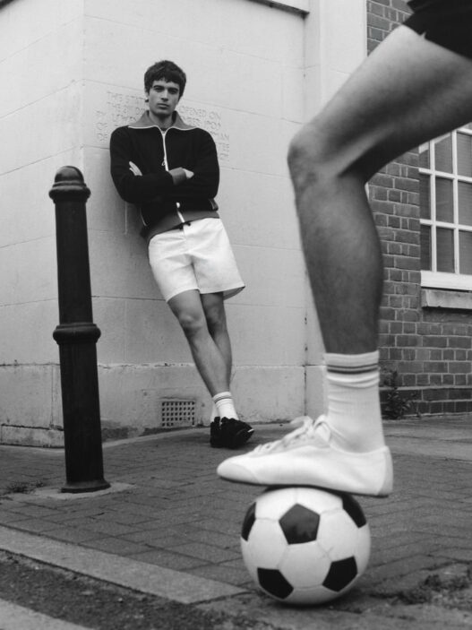
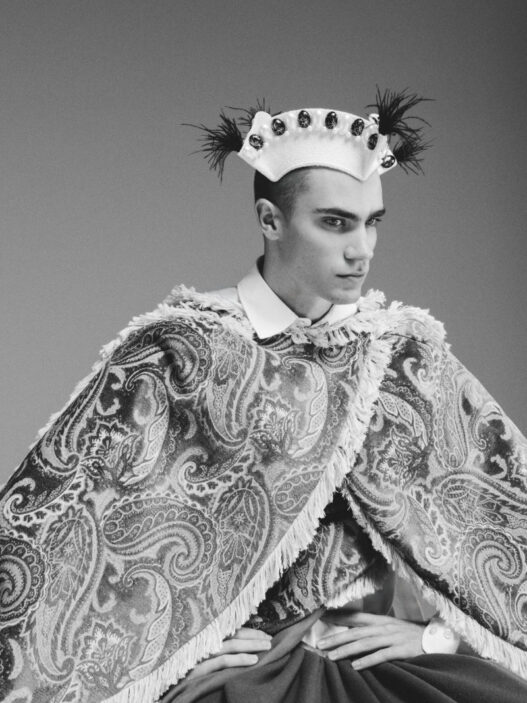
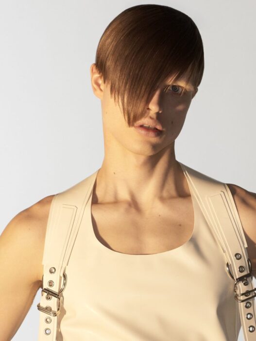
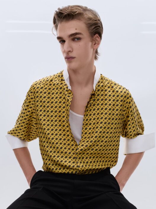
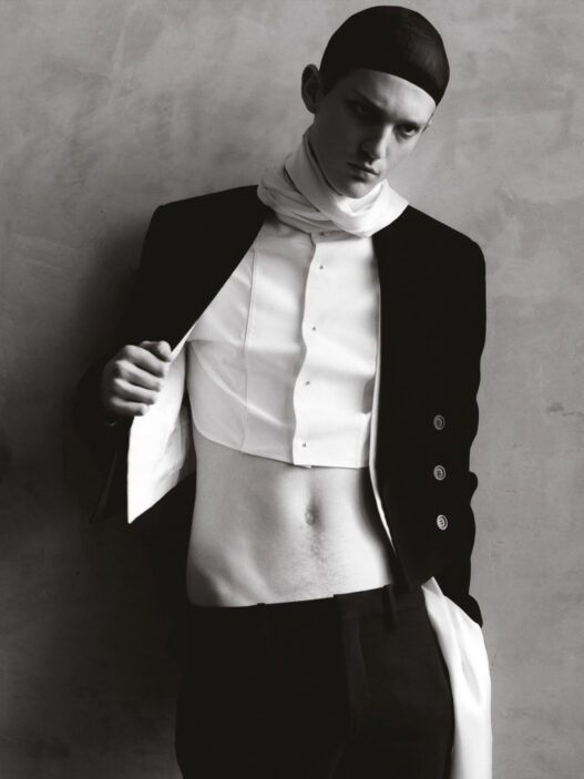
INYIM Media Fashion Star Boy: Featuring Model Alessandro Borzumato Via Boom Models Shot By Alessandra Huynh!
/* ========================================================= INYIM — Editorial System Typography + Images + Captions + Embeds + Editorial Classes Updated: restored constrained body images while preserving optional wide editorial treatments. ========================================================= */ /* ------------------------- EXCERPT / DEK ------------------------- */ .single-post .cs-entry__subtitle{ font-family: Inter, system-ui, -apple-system, BlinkMacSystemFont, "Segoe UI", sans-serif; font-weight: 400; line-height: 1.5; opacity: 1 !important; color: rgba(255,255,255,0.96) !important; text-shadow: 0 1px 2px rgba(0,0,0,0.45); margin: 0.75rem 0 1rem; max-width: 820px; } /* ------------------------- BODY TYPOGRAPHY ------------------------- */ .single-post .entry-content, .single-post .entry-content p, .single-post .entry-content li, .single-post .entry-content blockquote{ font-family: "Source Serif 4", Georgia, "Times New Roman", serif; } .single-post .entry-content p{ font-size: 18px; line-height: 1.7; margin-bottom: 1.15rem; } .single-post .entry-content li{ font-size: 18px; line-height: 1.65; } /* ------------------------- HEADINGS ------------------------- */ .single-post .entry-content h2, .single-post .entry-content h3, .single-post .entry-content h4{ font-family: Inter, system-ui, -apple-system, BlinkMacSystemFont, "Segoe UI", sans-serif; color: #111; } .single-post .entry-content h2{ font-size: clamp(28px, 3vw, 36px); font-weight: 800; line-height: 1.08; letter-spacing: -0.03em; margin-top: 2.2rem; margin-bottom: 0.8rem; } .single-post .entry-content h3{ font-size: clamp(22px, 2.2vw, 26px); font-weight: 750; line-height: 1.14; letter-spacing: -0.02em; margin-top: 1.8rem; margin-bottom: 0.7rem; } .single-post .entry-content h4{ font-size: 19px; font-weight: 750; line-height: 1.2; letter-spacing: -0.01em; margin-top: 1.5rem; margin-bottom: 0.65rem; } /* ------------------------- CONTENT WIDTH ------------------------- */ .single-post .entry-content{ max-width: 760px; margin-left: auto; margin-right: auto; } /* ------------------------- BODY LINKS ------------------------- */ .single-post .entry-content p a, .single-post .entry-content li a{ color: #0057d9; font-weight: 600; text-decoration: underline; text-decoration-thickness: 1px; text-underline-offset: 3px; } .single-post .entry-content p a:hover, .single-post .entry-content li a:hover{ text-decoration-thickness: 2px; } /* ------------------------- IMAGE BASE ------------------------- */ .single-post .entry-content img{ max-width: 100%; height: auto; display: block; border-radius: 6px; max-height: 78vh; object-fit: contain; } /* Alignment */ .single-post .entry-content .alignleft{ float: left; margin: 0.4rem 1.2rem 1rem 0; } .single-post .entry-content .alignright{ float: right; margin: 0.4rem 0 1rem 1.2rem; } .single-post .entry-content::after{ content: ""; display: table; clear: both; } /* ------------------------- FIGURE SYSTEM Standard body images are intentionally constrained. ------------------------- */ .single-post .entry-content figure.wp-block-image{ width: fit-content !important; max-width: 60% !important; margin: 1.8rem auto !important; text-align: left; } .single-post .entry-content figure.wp-block-image img{ width: auto !important; max-width: 100% !important; height: auto !important; display: block !important; margin: 0 auto !important; max-height: 68vh !important; object-fit: contain !important; } /* Keep caption width matched to the actual figure */ .single-post .entry-content figure.wp-block-image figcaption{ width: 100%; } /* Legacy direct images inside paragraphs */ .single-post .entry-content p > img, .single-post .entry-content p > a > img, .single-post .entry-content .wp-caption, .single-post .entry-content .aligncenter{ width: auto !important; max-width: 60% !important; height: auto !important; margin-left: auto !important; margin-right: auto !important; } /* ------------------------- OPTIONAL EDITORIAL IMAGE CLASSES Add in Gutenberg: Block > Advanced > Additional CSS class(es) ------------------------- */ /* Wider magazine-style image */ .single-post .entry-content figure.wp-block-image.inyim-wide-image{ width: min(920px, calc(100vw - 40px)); max-width: none; margin-top: 2.4rem; margin-bottom: 2.4rem; margin-left: 50%; transform: translateX(-50%); } .single-post .entry-content figure.wp-block-image.inyim-wide-image img{ width: 100%; max-width: 100%; max-height: 90vh; } /* Tighter image run for fashion/editorial sequences */ .single-post .entry-content figure.wp-block-image.inyim-image-sequence{ margin-top: 0.8rem; margin-bottom: 0.8rem; } /* Extra visual pause around a key image */ .single-post .entry-content figure.wp-block-image.inyim-visual-break{ margin-top: 3rem; margin-bottom: 3rem; } /* Consecutive image rhythm */ .single-post .entry-content figure.wp-block-image + figure.wp-block-image{ margin-top: 0.9rem; } .single-post .entry-content figure.wp-block-image + p{ margin-top: 2rem; } /* ------------------------- CAPTIONS ------------------------- */ .single-post .entry-content figure.wp-block-image figcaption{ margin-top: 0.45rem; font-family: Inter, system-ui, -apple-system, BlinkMacSystemFont, "Segoe UI", sans-serif; font-size: 12.5px; line-height: 1.4; color: rgba(0,0,0,0.68); text-align: left; box-sizing: border-box; } .single-post .entry-content .wp-caption-text, .single-post .entry-content .blocks-gallery-caption{ width: fit-content; max-width: 60%; margin: 0.45rem auto 0; text-align: left; font-family: Inter, system-ui, -apple-system, BlinkMacSystemFont, "Segoe UI", sans-serif; font-size: 12.5px; line-height: 1.4; color: rgba(0,0,0,0.68); } /* ------------------------- GALLERIES ------------------------- */ .single-post .entry-content .wp-block-gallery{ margin: 2rem auto; gap: 10px; } .single-post .entry-content .wp-block-gallery img{ width: 100%; max-height: none; object-fit: cover; border-radius: 5px; } /* ------------------------- BLOCKQUOTES ------------------------- */ .single-post .entry-content blockquote{ margin: 2rem 0; padding: 0.25rem 0 0.25rem 1.25rem; border-left: 4px solid #0057d9; color: #222; font-size: 21px; line-height: 1.55; font-style: italic; } .single-post .entry-content blockquote p{ font-size: inherit; line-height: inherit; margin-bottom: 0.75rem; } .single-post .entry-content blockquote p:last-child{ margin-bottom: 0; } /* ------------------------- INSTAGRAM EMBEDS Keep posts and Reels centered and narrower than the text column. ------------------------- */ .single-post .entry-content .instagram-media, .single-post .entry-content blockquote.instagram-media, .single-post .entry-content .wp-block-embed-instagram, .single-post .entry-content .wp-block-embed.is-provider-instagram{ width: 100% !important; max-width: 430px !important; margin: 1.5rem auto !important; } .single-post .entry-content .instagram-media iframe, .single-post .entry-content blockquote.instagram-media iframe, .single-post .entry-content .wp-block-embed-instagram iframe, .single-post .entry-content .wp-block-embed.is-provider-instagram iframe{ width: 100% !important; max-width: 430px !important; margin-left: auto !important; margin-right: auto !important; } @media (max-width: 768px){ .single-post .entry-content .instagram-media, .single-post .entry-content blockquote.instagram-media, .single-post .entry-content .wp-block-embed-instagram, .single-post .entry-content .wp-block-embed.is-provider-instagram, .single-post .entry-content .instagram-media iframe, .single-post .entry-content blockquote.instagram-media iframe, .single-post .entry-content .wp-block-embed-instagram iframe, .single-post .entry-content .wp-block-embed.is-provider-instagram iframe{ max-width: 92% !important; } } /* ------------------------- EMBEDS ------------------------- */ .single-post .entry-content .wp-block-embed, .single-post .entry-content .wp-block-video{ display: block; margin: 1rem auto 1.4rem; max-width: 760px; } .single-post .entry-content iframe{ width: 100%; border-radius: 6px; max-height: none !important; } .single-post .entry-content iframe[src*="youtube"], .single-post .entry-content iframe[src*="youtu.be"]{ aspect-ratio: 16 / 9; } /* ------------------------- SPACING ------------------------- */ .single-post .entry-content h2 + .wp-block-embed, .single-post .entry-content h3 + .wp-block-embed{ margin-top: 0.6rem; } .single-post .entry-content p + h2{ margin-top: 2.2rem; } .single-post .entry-content p + h3{ margin-top: 1.8rem; } /* ------------------------- MOBILE ------------------------- */ @media (max-width: 768px){ .single-post .entry-content{ padding-left: 1rem; padding-right: 1rem; } .single-post .entry-content p, .single-post .entry-content li{ font-size: 17px; line-height: 1.68; } .single-post .entry-content h2{ font-size: clamp(27px, 8vw, 32px); margin-top: 2rem; } .single-post .entry-content h3{ font-size: clamp(22px, 6.5vw, 25px); margin-top: 1.65rem; } .single-post .entry-content img{ max-height: 68vh; } /* Standard mobile body images remain smaller than the text width */ .single-post .entry-content figure.wp-block-image{ max-width: 78% !important; } .single-post .entry-content figure.wp-block-image img{ max-height: 66vh; } .single-post .entry-content p > img, .single-post .entry-content p > a > img, .single-post .entry-content .wp-caption, .single-post .entry-content .aligncenter{ max-width: 78% !important; } /* Only intentionally tagged wide images expand */ .single-post .entry-content figure.wp-block-image.inyim-wide-image{ width: calc(100vw - 24px); max-width: none; margin-left: 50%; transform: translateX(-50%); } .single-post .entry-content figure.wp-block-image.inyim-wide-image img{ width: 100%; max-height: 82vh; } .single-post .entry-content figure.wp-block-image.inyim-image-sequence{ margin-top: 0.65rem; margin-bottom: 0.65rem; } .single-post .entry-content figure.wp-block-image.inyim-visual-break{ margin-top: 2.4rem; margin-bottom: 2.4rem; } .single-post .entry-content .wp-caption-text{ max-width: 78%; } .single-post .entry-content blockquote{ margin: 1.7rem 0; padding-left: 1rem; font-size: 19px; } .single-post .entry-content .alignleft, .single-post .entry-content .alignright{ float: none; margin-left: auto; margin-right: auto; } }